Appearance
Theme components
Garnet provides theme components for the marketplace. All components can be recreated using liquid code, or any other frontend framework. They can be drag-and-drop directly in your Shopify theme.
Vendor directory component
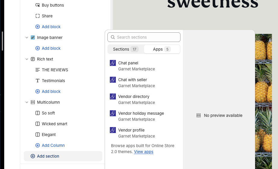
Add the vendor directory where you need to use Garnet's built-in components. Open your Shopify theme editor, navigate to the page you want to change, add a section and select Vendor directory.
You can customize the component with the following settings:
- Image display: How images should fit the tile.
- Show vendors without images: hide/show vendors that did not provide any images.
- Fallback image: In case you are displaying missing images, select a fallback image.
- Images height (px): The height of the image tile. The width will be automatically computed.
- Images per column: Number of columns to show.
- Gap between images (px): the space between columns.
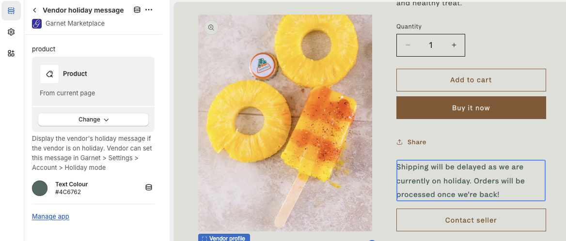
Vendor holiday component
Displays the vendor holiday message. The message will only show if the vendor is on holiday during this specific day.
The message is automatically hidden when the holiday is over. It can be displayed anywhere in your store. Usually it is right below the purchase buttons.
Follow this link to learn more about the holiday feature.
You can customize the component with the following settings:
- Product: The vendor's product to use as a reference to find the vendor's holiday settings
- Text color: The color of the vendor's holiday message. Default: Red.
Vendor profile component
Display the vendor's image and description next to the product information.
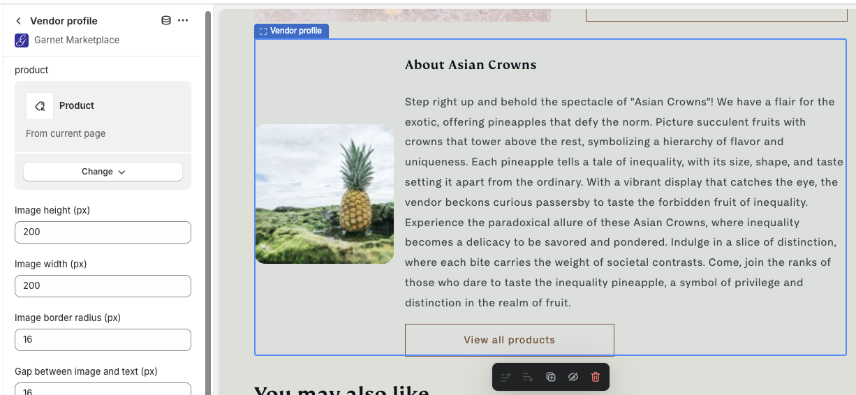
You can customize the component with the following settings:
- Product: The product to extract the vendor from,
- Image height (px): The height of the image,
- Image width (px): The width of the image,
- Image rounded corner (px): Add rounding to the image corner (0px for no rounding),
- Gap between image and text (px): Distance between the image and the text,
- Display as column: Check to display the image above the text,
- Button text: If the vendor has a vendor page, you can specify the call-to-action text,
- Button classes: Add classes to the call-to-action to match your theme's design.
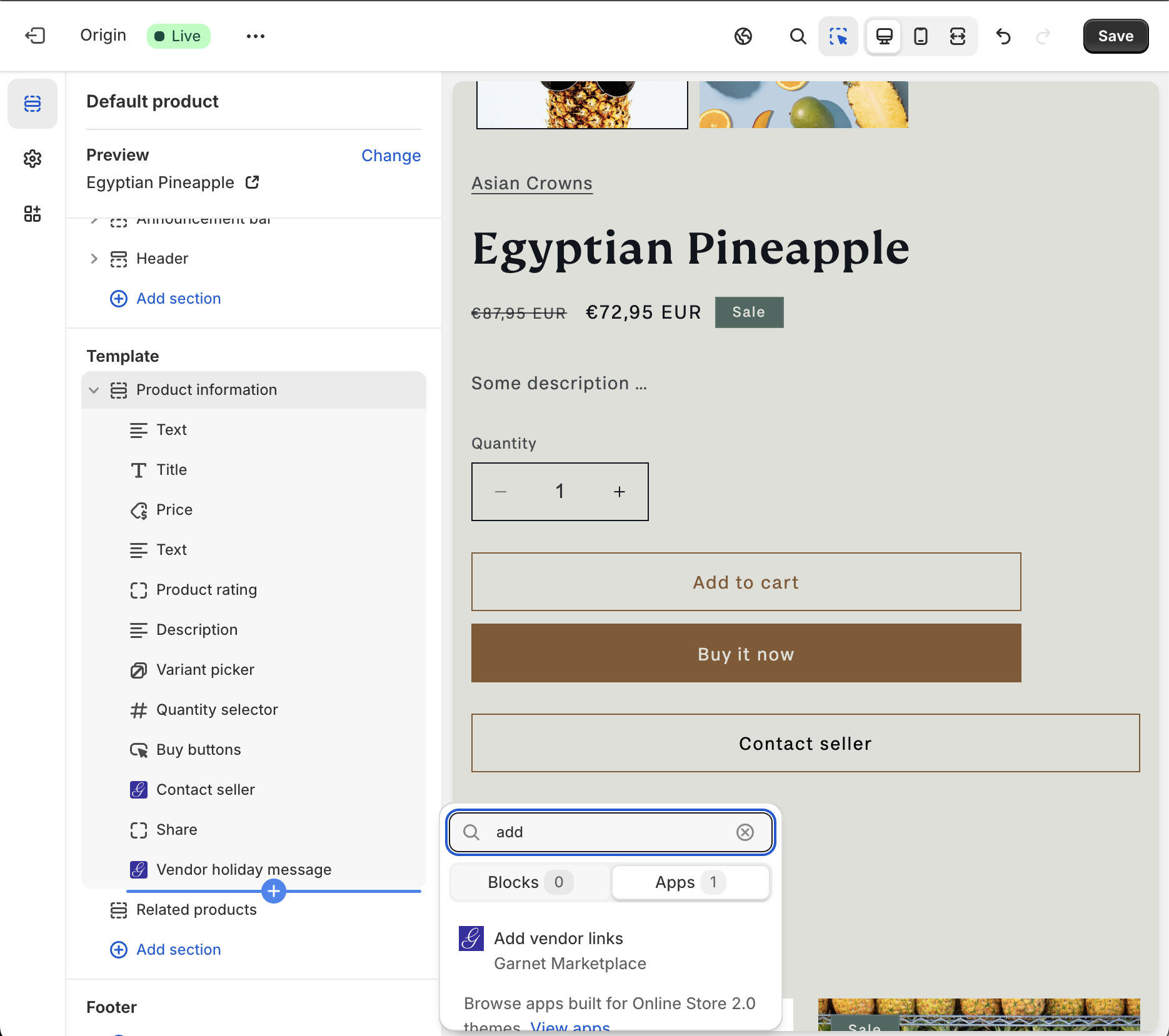
Vendor links component
See the populate vendor page for more information.
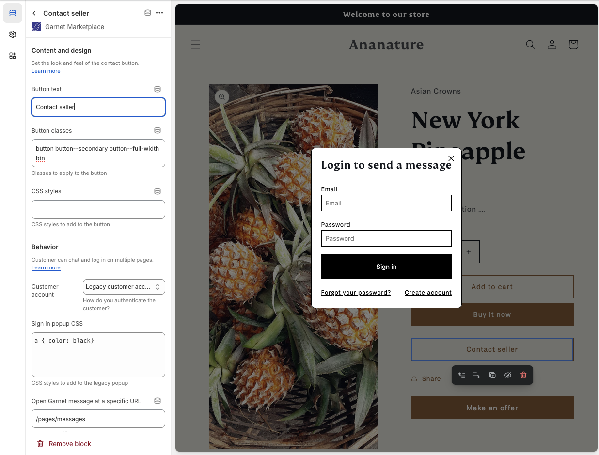
Message button component
See the messaging setup for more information. The template allows the marketplace to edit the CSS and classes of the component.
Garnet embedded
Allow the marketplace to use their customer as vendor. Using the embedded version completely removes Garnet's authentication flow and relies on Shopify authentication. It automatically implements Garnet's Single Sign On.
Please contact us for more information.